Category
Tags
This is the second part of our post series about the exploratory analysis of a publicly available dataset reporting earthquakes and similar events within a specific time window of 30 days. In the following, we are going to analyze the categorical variables of our dataset. The categorical variables can take on one of a limited, and usually fixed a number of possible values. Factor variables are categorical variables that can be either numeric or string variables. R stores categorical variables into a factor. Their analysis may require statistical tools different from the ones used for quantitative variables.
Packages
I am going to take advantage of the following packages.
suppressPackageStartupMessages(library(ggplot2))
suppressPackageStartupMessages(library(dplyr))
suppressPackageStartupMessages(library(Hmisc))
suppressPackageStartupMessages(library(lubridate))
suppressPackageStartupMessages(library(vcd))
suppressPackageStartupMessages(library(vcdExtra))
suppressPackageStartupMessages(library(gmodels))
Packages versions are herein listed.
packages <- c("ggplot2", "dplyr", "Hmisc", "lubridate", "vcd", "vcdExtra", "gmodels")
version <- lapply(packages, packageVersion)
version_c <- do.call(c, version)
data.frame(packages=packages, version = as.character(version_c))
##    packages version
## 1   ggplot2   3.1.0
## 2     dplyr 0.8.0.1
## 3     Hmisc   4.2.0
## 4 lubridate   1.7.4
## 5       vcd   1.4.4
## 6  vcdExtra   0.7.1
## 7   gmodels  2.18.1
Running on Windows-10 the following R language version.
R.version
##                _
## platform       x86_64-w64-mingw32
## arch           x86_64
## os             mingw32
## system         x86_64, mingw32
## status
## major          3
## minor          5.2
## year           2018
## month          12
## day            20
## svn rev        75870
## language       R
## version.string R version 3.5.2 (2018-12-20)
## nickname       Eggshell Igloo
Getting Data
As shown in the first post, we start our analysis by downloading the earthquake dataset from earthquake.usgs.gov site, specifically the last 30 days dataset flavor. Please note that such eartquake dataset is day by day updated to cover the last 30 days of data collection. Furthermore, it is not the most recent dataset available, as I collected it some weeks ago. If such dataset is not already present into our workspace, we download and save it to be loaded into the quakes local variable.
if ("all_week.csv" %in% dir(".") == FALSE) {
  url <- "https://earthquake.usgs.gov/earthquakes/feed/v1.0/summary/all_month.csv"
  download.file(url = url, destfile = "all_week.csv")
}
quakes <- read.csv("all_month.csv", header=TRUE, sep=',', stringsAsFactors = FALSE)

quakes$time <- ymd_hms(quakes$time)
quakes$updated <- ymd_hms(quakes$updated)
quakes$magType <- as.factor(quakes$magType)
quakes$net <- as.factor(quakes$net)
quakes$type <- as.factor(quakes$type)
quakes$status <- as.factor(quakes$status)
quakes$locationSource <- as.factor(quakes$locationSource)
quakes$magSource <- as.factor(quakes$magSource)
Exploratory Analysis – Categorical Variables
The categorical variables can be detected by testing if their class is factor.
(factor_vars <- names(which(sapply(quakes, class) == "factor")))
## [1] "magType"        "net"            "type"           "status"
## [5] "locationSource" "magSource"
length(factor_vars)
## [1] 6
The describe() function within HMisc package can be useful for categorical variables as well.
describe(quakes[,factor_vars])
## quakes[, factor_vars]
##
##  6  Variables      8407  Observations
## ---------------------------------------------------------------------------
## magType
##        n  missing distinct
##     8407        0       10
##
## Value               mb mb_lg    md    mh    ml   mun    mw   mwr   mww
## Frequency      2   604    47  2423    14  5203     2     4    19    89
## Proportion 0.000 0.072 0.006 0.288 0.002 0.619 0.000 0.000 0.002 0.011
## ---------------------------------------------------------------------------
## net
##        n  missing distinct
##     8407        0       14
##
## ak (2469, 0.294), ci (1344, 0.160), hv (253, 0.030), ismpkansas (8,
## 0.001), ld (4, 0.000), mb (157, 0.019), nc (1435, 0.171), nm (28, 0.003),
## nn (604, 0.072), pr (427, 0.051), se (15, 0.002), us (897, 0.107), uu
## (588, 0.070), uw (178, 0.021)
## ---------------------------------------------------------------------------
## type
##        n  missing distinct
##     8407        0        7
##
## chemical explosion (2, 0.000), earthquake (8232, 0.979), explosion (58,
## 0.007), ice quake (16, 0.002), other event (3, 0.000), quarry blast (95,
## 0.011), rock burst (1, 0.000)
## ---------------------------------------------------------------------------
## status
##        n  missing distinct
##     8407        0        2
##
## Value      automatic  reviewed
## Frequency       1691      6716
## Proportion     0.201     0.799
## ---------------------------------------------------------------------------
## locationSource
##        n  missing distinct
##     8407        0       15
##
## Value         ak    ci    hv  ismp    ld    mb    nc    nm    nn    ok
## Frequency   2470  1344   253     8     4   157  1435    28   604     6
## Proportion 0.294 0.160 0.030 0.001 0.000 0.019 0.171 0.003 0.072 0.001
##
## Value         pr    se    us    uu    uw
## Frequency    427    15   890   588   178
## Proportion 0.051 0.002 0.106 0.070 0.021
## ---------------------------------------------------------------------------
## magSource
##        n  missing distinct
##     8407        0       15
##
## Value         ak    ci    hv  ismp    ld    mb    nc    nm    nn    ok
## Frequency   2480  1344   253     8     4   157  1435    28   604     5
## Proportion 0.295 0.160 0.030 0.001 0.000 0.019 0.171 0.003 0.072 0.001
##
## Value         pr    se    us    uu    uw
## Frequency    427    15   881   588   178
## Proportion 0.051 0.002 0.105 0.070 0.021
## ---------------------------------------------------------------------------
We notice from the magType description that two records have a null string magType. We then replace them we the NA value.
quakes$magType[quakes$magType == ""] <- NA
To understand relationship or dependencies among categorical variables, we take advantage of various types of tables and graphical methods. Also stratifying variables can be encompassed in order to highlight if the relationship between two primary variables is the same or different for all levels of the stratifying variable under consideration.
The contingency table are said to be of one-way flavor when involving just one categorical variable. They are said two-way when involving two categorical variables, and so on (N-way).
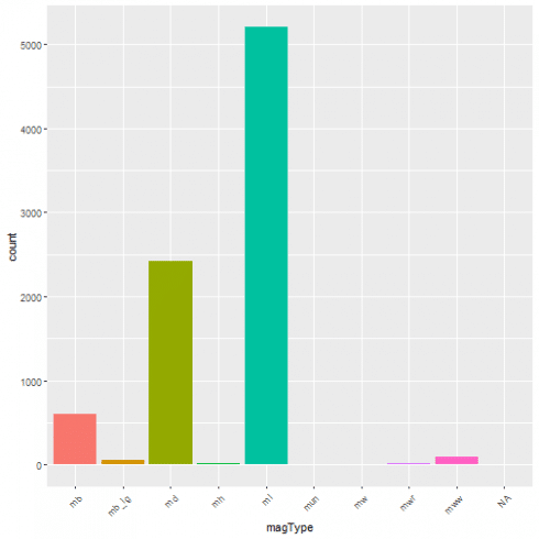
For example, here is the one-way contingency table for the magType variable.
(tbl <- table(quakes$magType))
##
##          mb mb_lg    md    mh    ml   mun    mw   mwr   mww
##     0   604    47  2423    14  5203     2     4    19    89
A graphical representation of the same as bar plot is shown.
ggplot(data = quakes, aes(x=magType, fill = magType)) + geom_bar(stat='count') + theme(axis.text.x = element_text(angle = 45, hjust = 1)) + guides(fill=FALSE)
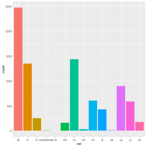
One-way contingency table of events based on the network the event has been registered from.
table(quakes$net)
##
##         ak         ci         hv ismpkansas         ld         mb
##       2469       1344        253          8          4        157
##         nc         nm         nn         pr         se         us
##       1435         28        604        427         15        897
##         uu         uw
##        588        178
A graphical representation of the same as bar plot is shown.
ggplot(data = quakes, aes(x = net, fill = net)) + geom_bar(stat = 'count') + guides(fill = FALSE)
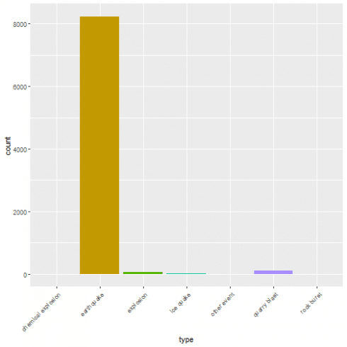
One-way contingency table of the events based on their type.
table(quakes$type)
##
## chemical explosion         earthquake          explosion
##                  2               8232                 58
##          ice quake        other event       quarry blast
##                 16                  3                 95
##         rock burst
##                  1
A graphical representation of the same as bar plot is shown.
ggplot(data = quakes, aes(x = type, fill = type)) + geom_bar(stat = 'count') + theme(axis.text.x = element_text(angle = 45, hjust = 1)) + guides(fill = FALSE)
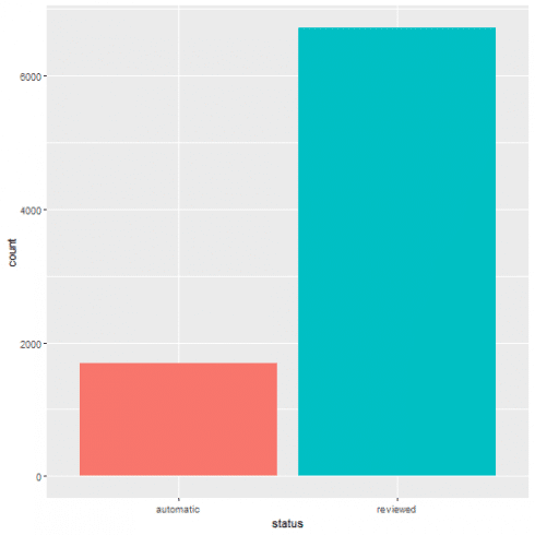
One-way contingency table of events based on their status.
table(quakes$status)
##
## automatic  reviewed
##      1691      6716
A graphical representation of the same as bar plot is shown.
ggplot(data = quakes, aes(x = status, fill = status)) + geom_bar(stat='count') + guides(fill=FALSE)
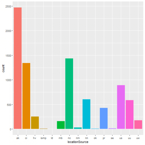
One-way contingency table of events based on the location source.
table(quakes$locationSource)
##
##   ak   ci   hv ismp   ld   mb   nc   nm   nn   ok   pr   se   us   uu   uw
## 2470 1344  253    8    4  157 1435   28  604    6  427   15  890  588  178
A graphical representation of the same as bar plot is shown.
ggplot(data = quakes, aes(x = locationSource, fill = locationSource)) + geom_bar(stat='count') + guides(fill=FALSE)
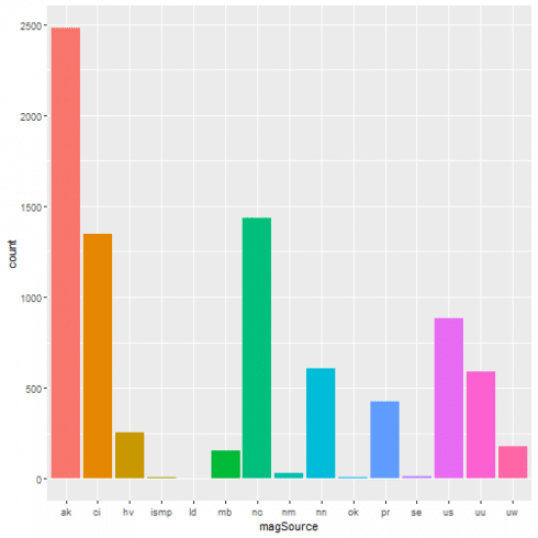
One-way contingency table of the events based on the network that originally authored the reported magnitude for this event.
table(quakes$magSource)
##
##   ak   ci   hv ismp   ld   mb   nc   nm   nn   ok   pr   se   us   uu   uw
## 2480 1344  253    8    4  157 1435   28  604    5  427   15  881  588  178
A graphical representation of the same as bar plot is shown.
ggplot(data = quakes, aes(x = magSource, fill = magSource)) + geom_bar(stat='count') + guides(fill=FALSE)
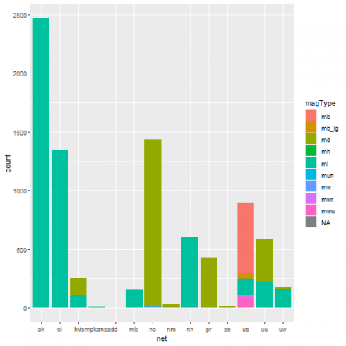
Two-way contingency table based upon the network as data contributor and the magType, i.e. the method or algorithm used to calculate the preferred magnitude for the event
table(quakes$net, quakes$magType)
##
##                     mb mb_lg   md   mh   ml  mun   mw  mwr  mww
##   ak            0    1     0    0    0 2467    0    0    0    1
##   ci            0    0     0    0    3 1339    2    0    0    0
##   hv            0    0     0  145    0  108    0    0    0    0
##   ismpkansas    0    0     0    0    0    8    0    0    0    0
##   ld            0    0     0    0    0    4    0    0    0    0
##   mb            0    0     0    6    0  151    0    0    0    0
##   nc            0    0     0 1423    0    7    0    3    0    0
##   nm            0    0     0   28    0    0    0    0    0    0
##   nn            0    0     0    0    0  604    0    0    0    0
##   pr            0    0     0  425    0    2    0    0    0    0
##   se            0    0     0   15    0    0    0    0    0    0
##   us            0  603    47    0    0  140    0    0   19   88
##   uu            0    0     0  365    0  222    0    1    0    0
##   uw            0    0     0   16   11  151    0    0    0    0
A graphical representation of the same as bar plot is shown.
ggplot(data = quakes, aes(x=net, fill = magType)) + geom_bar(stat='count')
Starting from this two-way contingency table:
(tbl <- table(quakes$net, quakes$status))
##
##              automatic reviewed
##   ak              1105     1364
##   ci                29     1315
##   hv                90      163
##   ismpkansas         0        8
##   ld                 0        4
##   mb                 0      157
##   nc               460      975
##   nm                 0       28
##   nn                 6      598
##   pr                 0      427
##   se                 0       15
##   us                 0      897
##   uu                 0      588
##   uw                 1      177
its corresponding row proportions table is shown. Each row shows the fraction of automatic/reviewed earthquakes given a certain network. Each row sum up to one.
prop.table(tbl, 1)
##
##                automatic    reviewed
##   ak         0.447549615 0.552450385
##   ci         0.021577381 0.978422619
##   hv         0.355731225 0.644268775
##   ismpkansas 0.000000000 1.000000000
##   ld         0.000000000 1.000000000
##   mb         0.000000000 1.000000000
##   nc         0.320557491 0.679442509
##   nm         0.000000000 1.000000000
##   nn         0.009933775 0.990066225
##   pr         0.000000000 1.000000000
##   se         0.000000000 1.000000000
##   us         0.000000000 1.000000000
##   uu         0.000000000 1.000000000
##   uw         0.005617978 0.994382022
Column proportions table. Each row shows the fraction of earthquakes network given a specific status (automatic/reviewed). Each column sums up to one.
prop.table(tbl, 2)
##
##                 automatic     reviewed
##   ak         0.6534594914 0.2030970816
##   ci         0.0171496156 0.1958010721
##   hv         0.0532229450 0.0242703990
##   ismpkansas 0.0000000000 0.0011911852
##   ld         0.0000000000 0.0005955926
##   mb         0.0000000000 0.0233770101
##   nc         0.2720283856 0.1451756998
##   nm         0.0000000000 0.0041691483
##   nn         0.0035481963 0.0890410959
##   pr         0.0000000000 0.0635795116
##   se         0.0000000000 0.0022334723
##   us         0.0000000000 0.1335616438
##   uu         0.0000000000 0.0875521144
##   uw         0.0005913661 0.0263549732
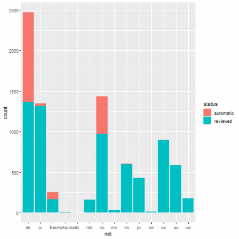
Let us condider the bar plot that can be the plot to represent the net based events counts and, at the same time, highlighting its status with different fill colors.
ggplot(data = quakes, aes(x = net, fill = status)) + geom_bar(stat = 'count')
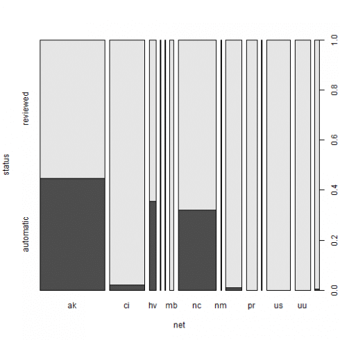
We want to give a better graphical representation, where the different proportion in status can be better perceived. We then build a dataframe collecting our network + status earthquakes information in frequency form. Starting from it, we will show the resulting spineplot.
tbl_df <- as.data.frame(tbl)
colnames(tbl_df) <- c("net", "status", "Freq")
tbl_df$net <- factor(tbl_df$net)
tbl_df
##           net    status Freq
## 1          ak automatic 1105
## 2          ci automatic   29
## 3          hv automatic   90
## 4  ismpkansas automatic    0
## 5          ld automatic    0
## 6          mb automatic    0
## 7          nc automatic  460
## 8          nm automatic    0
## 9          nn automatic    6
## 10         pr automatic    0
## 11         se automatic    0
## 12         us automatic    0
## 13         uu automatic    0
## 14         uw automatic    1
## 15         ak  reviewed 1364
## 16         ci  reviewed 1315
## 17         hv  reviewed  163
## 18 ismpkansas  reviewed    8
## 19         ld  reviewed    4
## 20         mb  reviewed  157
## 21         nc  reviewed  975
## 22         nm  reviewed   28
## 23         nn  reviewed  598
## 24         pr  reviewed  427
## 25         se  reviewed   15
## 26         us  reviewed  897
## 27         uu  reviewed  588
## 28         uw  reviewed  177
The spineplot makes more evident count differences of the status among net providing with a common scale in the range [0,1].
(xtabs_res <- xtabs(Freq ~ net + status, data = tbl_df))
##             status
## net          automatic reviewed
##   ak              1105     1364
##   ci                29     1315
##   hv                90      163
##   ismpkansas         0        8
##   ld                 0        4
##   mb                 0      157
##   nc               460      975
##   nm                 0       28
##   nn                 6      598
##   pr                 0      427
##   se                 0       15
##   us                 0      897
##   uu                 0      588
##   uw                 1      177
spineplot(xtabs_res)
The xtabs() function creates cross-tabulations of data using the formula style input. Further, applying the summary() to the xtabs() result, we get a chi-squared test of independence of all factors, while indicating the number of cases and dimensions.
type_net_count <- quakes %>% group_by(status, net) %>% dplyr::summarise(Freq = n())
xtabs_res <- xtabs(Freq ~ net + status, data = type_net_count)
summary(xtabs_res)
## Call: xtabs(formula = Freq ~ net + status, data = type_net_count)
## Number of cases in table: 8407
## Number of factors: 2
## Test for independence of all factors:
##  Chisq = 2082.2, df = 13, p-value = 0
##  Chi-squared approximation may be incorrect
Same spineplot as resulting by a slightly different approach.
spineplot(xtabs_res)
Margin tables are another way to summarise categorical data.
(mt <- margin.table(tbl, 2:1))
##
##               ak   ci   hv ismpkansas   ld   mb   nc   nm   nn   pr   se
##   automatic 1105   29   90          0    0    0  460    0    6    0    0
##   reviewed  1364 1315  163          8    4  157  975   28  598  427   15
##
##               us   uu   uw
##   automatic    0    0    1
##   reviewed   897  588  177
Per row and per column sums can be added by means of the addmargins() function.
addmargins(mt)
##
##               ak   ci   hv ismpkansas   ld   mb   nc   nm   nn   pr   se
##   automatic 1105   29   90          0    0    0  460    0    6    0    0
##   reviewed  1364 1315  163          8    4  157  975   28  598  427   15
##   Sum       2469 1344  253          8    4  157 1435   28  604  427   15
##
##               us   uu   uw  Sum
##   automatic    0    0    1 1691
##   reviewed   897  588  177 6716
##   Sum        897  588  178 8407
The Cross Tabulation result is shown.
mt <- margin.table(table(quakes$status, quakes$type), 2:1)
CrossTable(mt, prop.chisq = FALSE, prop.c = TRUE, prop.r = TRUE, format = "SPSS")
##
##    Cell Contents
## |-------------------------|
## |                   Count |
## |             Row Percent |
## |          Column Percent |
## |           Total Percent |
## |-------------------------|
##
## Total Observations in Table:  8407
##
##                    |
##                    | automatic  |  reviewed  | Row Total |
## -------------------|-----------|-----------|-----------|
## chemical explosion |        0  |        2  |        2  |
##                    |    0.000% |  100.000% |    0.024% |
##                    |    0.000% |    0.030% |           |
##                    |    0.000% |    0.024% |           |
## -------------------|-----------|-----------|-----------|
##         earthquake |     1688  |     6544  |     8232  |
##                    |   20.505% |   79.495% |   97.918% |
##                    |   99.823% |   97.439% |           |
##                    |   20.079% |   77.840% |           |
## -------------------|-----------|-----------|-----------|
##          explosion |        3  |       55  |       58  |
##                    |    5.172% |   94.828% |    0.690% |
##                    |    0.177% |    0.819% |           |
##                    |    0.036% |    0.654% |           |
## -------------------|-----------|-----------|-----------|
##          ice quake |        0  |       16  |       16  |
##                    |    0.000% |  100.000% |    0.190% |
##                    |    0.000% |    0.238% |           |
##                    |    0.000% |    0.190% |           |
## -------------------|-----------|-----------|-----------|
##        other event |        0  |        3  |        3  |
##                    |    0.000% |  100.000% |    0.036% |
##                    |    0.000% |    0.045% |           |
##                    |    0.000% |    0.036% |           |
## -------------------|-----------|-----------|-----------|
##       quarry blast |        0  |       95  |       95  |
##                    |    0.000% |  100.000% |    1.130% |
##                    |    0.000% |    1.415% |           |
##                    |    0.000% |    1.130% |           |
## -------------------|-----------|-----------|-----------|
##         rock burst |        0  |        1  |        1  |
##                    |    0.000% |  100.000% |    0.012% |
##                    |    0.000% |    0.015% |           |
##                    |    0.000% |    0.012% |           |
## -------------------|-----------|-----------|-----------|
##       Column Total |     1691  |     6716  |     8407  |
##                    |   20.114% |   79.886% |           |
## -------------------|-----------|-----------|-----------|
##
##
With the help of the structable within vcd package, we show a 3-WAY contingency table.
structable(type ~ status + magType, data = quakes)
##                   type chemical explosion earthquake explosion ice quake other event quarry blast rock burst
## status    magType
## automatic                               0          0         0         0           0            0          0
##           mb                            0          1         0         0           0            0          0
##           mb_lg                         0          0         0         0           0            0          0
##           md                            0        515         0         0           0            0          0
##           mh                            0          0         0         0           0            0          0
##           ml                            0       1172         3         0           0            0          0
##           mun                           0          0         0         0           0            0          0
##           mw                            0          0         0         0           0            0          0
##           mwr                           0          0         0         0           0            0          0
##           mww                           0          0         0         0           0            0          0
## reviewed                                0          0         0         0           0            0          0
##           mb                            0        603         0         0           0            0          0
##           mb_lg                         0         47         0         0           0            0          0
##           md                            0       1893         2         0           0           13          0
##           mh                            0         14         0         0           0            0          0
##           ml                            0       3873        53        16           3           82          1
##           mun                           2          0         0         0           0            0          0
##           mw                            0          4         0         0           0            0          0
##           mwr                           0         19         0         0           0            0          0
##           mww                           0         89         0         0           0            0          0
Geographical Regions vs. Depth Category Earthquakes Analysis
Based on ref. [5] definitions we create new factor variables.
earthquakes <- quakes %>% filter(type == "earthquake")
earthquakes <- earthquakes[complete.cases(earthquakes[, c("latitude", "longitude", "depth")]),]

emisphere_ns <- as.factor(ifelse(earthquakes$latitude >= 0, "north", "south"))
emisphere_ew <- as.factor(ifelse(earthquakes$longitude >= 0, "east", "west"))

earthquakes$region <- ifelse(earthquakes$latitude > 0 & earthquakes$longitude > 0, "NE",
                             ifelse(earthquakes$latitude > 0  & earthquakes$longitude < 0, "NW",
                                    ifelse(earthquakes$latitude < 0 & earthquakes$longitude > 0, "SE", "SW")))

earthquakes$depth_type <- ifelse(earthquakes$depth <= 70, "shallow", ifelse(earthquakes$depth <= 300, "intermediate", "deep"))
earthquakes$region <- factor(earthquakes$region)
earthquakes$depth_type <- factor(earthquakes$depth_type)
Resulting tables are shown.
(tbl <- table(earthquakes$region, earthquakes$depth_type))
##
##      deep intermediate shallow
##   NE    9           65     197
##   NW    0          526    7109
##   SE   10           40     109
##   SW   31           45      91
prop.table(tbl, 1)
##
##            deep intermediate    shallow
##   NE 0.03321033   0.23985240 0.72693727
##   NW 0.00000000   0.06889325 0.93110675
##   SE 0.06289308   0.25157233 0.68553459
##   SW 0.18562874   0.26946108 0.54491018
prop.table(tbl, 2)
##
##            deep intermediate    shallow
##   NE 0.18000000   0.09615385 0.02624567
##   NW 0.00000000   0.77810651 0.94710898
##   SE 0.20000000   0.05917160 0.01452172
##   SW 0.62000000   0.06656805 0.01212363
We wonder if the region plays a role for the depth type classification. We run the following chi-square test to figure it out.
chisq.test(earthquakes$region, earthquakes$depth_type, simulate.p.value = TRUE)
##
##  Pearson's Chi-squared test with simulated p-value (based on 2000
##  replicates)
##
## data:  earthquakes$region and earthquakes$depth_type
## X-squared = 1322.4, df = NA, p-value = 0.0004998
And it is statistically significant as the reported p-value highlights.
The Cross Tabulation is as follows.
mt <- margin.table(tbl, 2:1)
CrossTable(mt, prop.chisq = FALSE, prop.c = TRUE, prop.r = TRUE, format = "SPSS")
##
##    Cell Contents
## |-------------------------|
## |                   Count |
## |             Row Percent |
## |          Column Percent |
## |           Total Percent |
## |-------------------------|
##
## Total Observations in Table:  8232
##
##              |
##              |       NE  |       NW  |       SE  |       SW  | Row Total |
## -------------|-----------|-----------|-----------|-----------|-----------|
##         deep |        9  |        0  |       10  |       31  |       50  |
##              |   18.000% |    0.000% |   20.000% |   62.000% |    0.607% |
##              |    3.321% |    0.000% |    6.289% |   18.563% |           |
##              |    0.109% |    0.000% |    0.121% |    0.377% |           |
## -------------|-----------|-----------|-----------|-----------|-----------|
## intermediate |       65  |      526  |       40  |       45  |      676  |
##              |    9.615% |   77.811% |    5.917% |    6.657% |    8.212% |
##              |   23.985% |    6.889% |   25.157% |   26.946% |           |
##              |    0.790% |    6.390% |    0.486% |    0.547% |           |
## -------------|-----------|-----------|-----------|-----------|-----------|
##      shallow |      197  |     7109  |      109  |       91  |     7506  |
##              |    2.625% |   94.711% |    1.452% |    1.212% |   91.181% |
##              |   72.694% |   93.111% |   68.553% |   54.491% |           |
##              |    2.393% |   86.358% |    1.324% |    1.105% |           |
## -------------|-----------|-----------|-----------|-----------|-----------|
## Column Total |      271  |     7635  |      159  |      167  |     8232  |
##              |    3.292% |   92.748% |    1.931% |    2.029% |           |
## -------------|-----------|-----------|-----------|-----------|-----------|
##
##
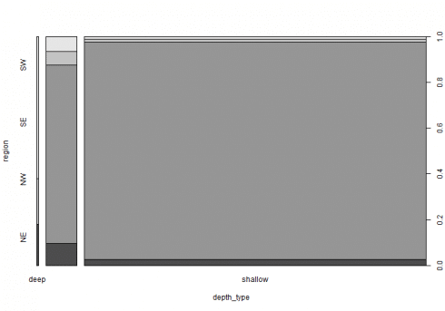
The spineplot is able to highlight the better difference in proportions than the barplot. We herein below show the resulting spineplot.
type_region_count <- earthquakes %>% group_by(depth_type, region) %>% dplyr::summarise(Freq = n())
xtabs_res <- xtabs(Freq ~ depth_type + region, data = type_region_count)
spineplot(xtabs_res)
Under independence hypothesis, we may compute expected frequencies as follows.
(exp <- independence_table(mt))
##
##                        NE         NW          SE         SW
##   deep           1.646016   46.37391   0.9657434   1.014334
##   intermediate  22.254130  626.97522  13.0568513  13.713800
##   shallow      247.099854 6961.65087 144.9774052 152.271866
We now bring our contingency table in frequency form.
tbl_df <- as.data.frame(tbl)
colnames(tbl_df) <- c("region", "depth_type", "Freq")
tbl_df$region <- factor(tbl_df$region)
tbl_df$depth_type <- factor(tbl_df$depth_type)
tbl_df
##    region   depth_type Freq
## 1      NE         deep    9
## 2      NW         deep    0
## 3      SE         deep   10
## 4      SW         deep   31
## 5      NE intermediate   65
## 6      NW intermediate  526
## 7      SE intermediate   40
## 8      SW intermediate   45
## 9      NE      shallow  197
## 10     NW      shallow 7109
## 11     SE      shallow  109
## 12     SW      shallow   91
Pattern of association can be revealed by the CMHtest() within vcdExtra package or the sieve plot.
CMHtest(Freq ~ region + depth_type, data = earthquakes)
## Cochran-Mantel-Haenszel Statistics for region by depth_type
##
##                  AltHypothesis   Chisq Df        Prob
## cor        Nonzero correlation  271.56  1  5.1951e-61
## rmeans  Row mean scores differ  817.17  3 8.1840e-177
## cmeans  Col mean scores differ  609.18  2 5.2283e-133
## general    General association 1322.22  6 1.6789e-282
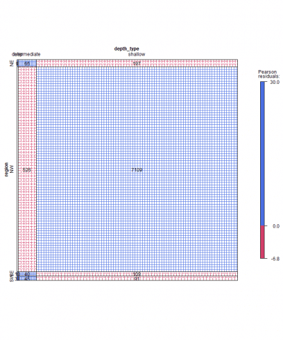
The sieve plot highlight frequencies different from the expected as determined by independency. The area of each rectangle is always proportional to expected frequency, however the observed frequency is shown by the number of squares in each rectangle.
sieve(Freq ~ region + depth_type, data = earthquakes, shade = TRUE, legend = TRUE, labeling = labeling_values)
Further, color and intensity of shadows together with the Pearson residuals legend highlight deviations from the expected.
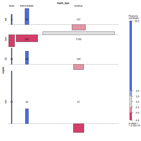
The association plot puts deviation from independence in the foreground, in the sense that the area of each box is made proportional to the (observed – expected) frequency. Cells with observed > expected frequency rise above the baseline representing independence, while cells that contain less than the expected frequency fall below it.
assoc(~ region + depth_type, data = earthquakes, shade = TRUE, legend = TRUE, labeling = labeling_values)
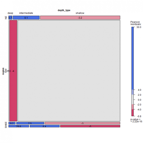
The mosaic plot can be applied to N-way contingency tables. For a 2-way table as herein shown, the mosaic display is like a grouped barchart, where the heights (or widths) of the bars show the relative frequencies of one variable and widths (or heights) of the sections in each bar show the conditional frequencies of the second variable given the first.
mosaic(~ region + depth_type, data = earthquakes, shade = TRUE, legend = TRUE, labeling = labeling_residuals)
Please note that in above mosaic plot, the frequency equal to zero for NW region deep earthquake does not find an explicit graphical representation. There are several labeling option for the mosaic plot, see Table 5.1 at ref. [4]. In our example, we choose to label the cells with the Pearson residuals value. The Pearson residuals can be computed as herein shown.
resids <- (mt - exp)/sqrt(exp)
round(resids, 1)
##                  NE   NW   SE   SW
##   deep          5.7 -6.8  9.2 29.8
##   intermediate  9.1 -4.0  7.5  8.4
##   shallow      -3.2  1.8 -3.0 -5.0
Where mt is the margin table, exp is the expected value based on indipendence hypothesis as previously computed above.
If you want to go more in detail with categorical data exploratory analysis, read ref. [4] as a valuable source of technical content and examples.
If you have any questions, please feel free to comment below.
References
- Earthquake dataset
- Eathquake dataset terms
- Introductory Statistics with R, 2nd Edition, P. Dalgaard, Springer
- Discrete Data Analysis with R, M. Friendly D. Meyer, CRC press
- Determining the Depth of an Earthquake
Related Post
